Blog

August 2025
Accessible graphic design – how important is it really? And what impact does it actually have? We recently ran a workshop with graphic design students at Bath Spa University exploring the real-world power of accessibility and inclusivity in design. We discussed why inclusive and accessible practices are not only the right thing to do, but also crucial for effective communication, audience reach and long-term brand success.
Before we jump in, a quick pause for definitions. In the context of design, accessibility is primarily about the removal of barriers to make your content and products usable by all individuals, particularly for those with diverse abilities, from colour-blindness to learning disabilities. Accessibility in graphic design enhances usability. Inclusivity in graphic design aims to create experiences where all individuals feel welcome and represented.
We recently covered the difference between accessible and inclusive design. Check it out here.
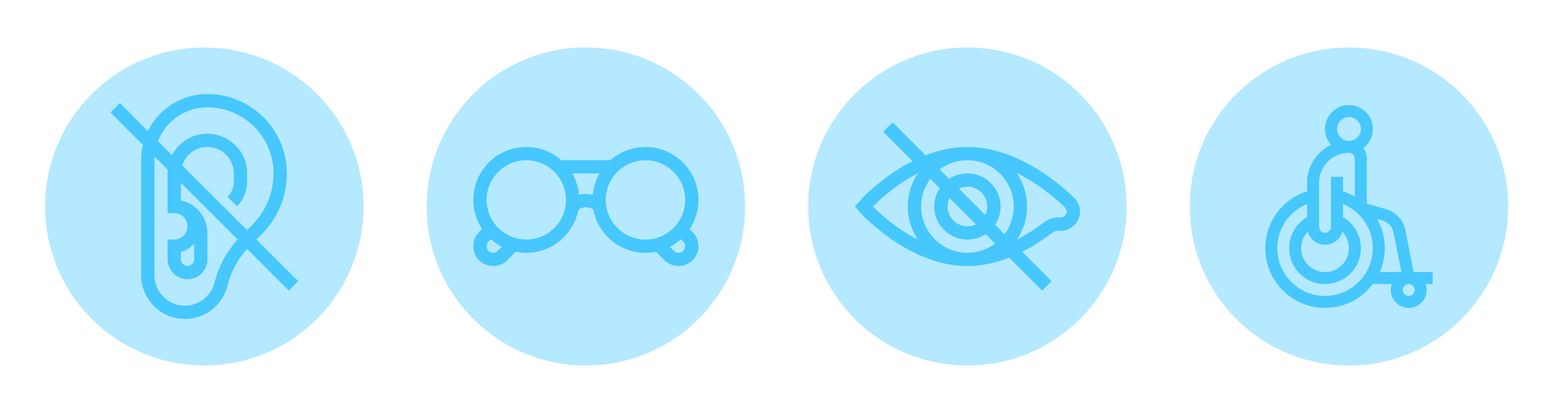
Accessible design allows users of diverse abilities to navigate, understand, and use your product (whether digital, print, a physical space or a service). At least 1 in 5 people in the UK have a long-term illness, impairment or disability, and many more have a temporary disability – that’s a huge portion of your audience. But accessibility isn’t just about supporting those with diverse abilities, it’s about improving the user experience for everyone.
At Transform, we’re guided by four key reasons why accessible design is critical:
So now you know why it’s important, and the opportunities it opens for users… let’s look at how to do it. Accessibility needs to be considered at all stages of a project, not just as a last-minute check at the end. It is essential to remember this is an ever-evolving space. There’s no one-size-fits-all solution and there is also no clear ‘moment of completion’.
Having some guiding principles can be a great starting point, but as always, these are a tool not a rule –
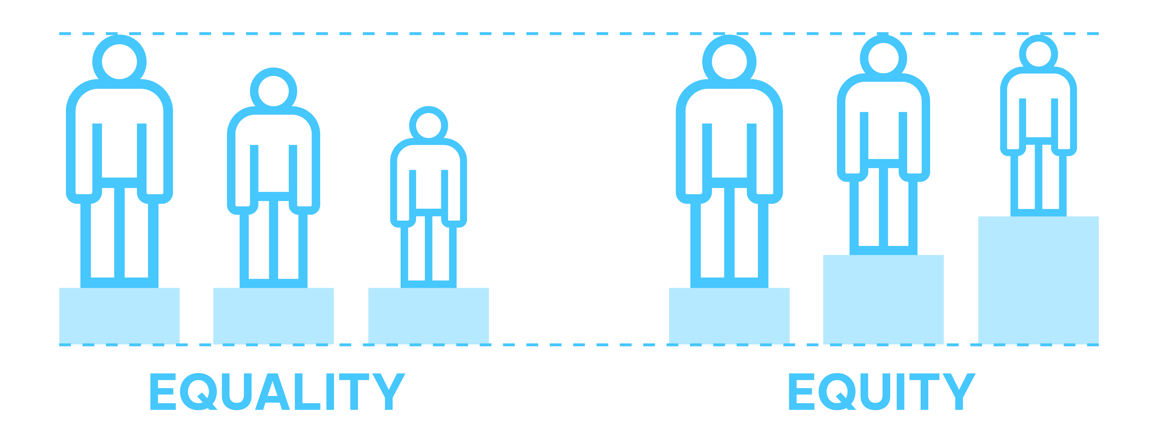
Accessibility and inclusivity initially took an equality approach rather than an equity approach – give everyone the same thing and it is fair. However, people’s disabilities, demographics and needs are incredibly different, and it does users a disservice not to address that. Taking an equity approach means everyone has the same opportunity, even if they don’t start from the same place.
Use defined grids and a consistent structure. Have a clear hierarchy of information, stick to consistent design elements and use recognisable iconography. Consistency mutually benefits designers and users. It will make your life as a designer so much easier and makes information comprehensive and clearer to understand.
Always pay attention to the end use of your design. You’ll be designing on a large, high-resolution screen, but your end users may be on an old laptop or using mobile rather than a desktop. Consider all contexts and test on a variety of formats. Zoom out, view at scale, print it and test on other screens. The more you physically interact with your designs early on in your career, the more intuitive your design process will become.
In large format, wayfinding and enviro design, keep perspective in mind. Avoid typefaces with thin features when designing for distance. Pedestrian scale vs vehicle scale is another thing to consider, as is traffic. A highway sign will need a completely different treatment to an A5 standee on a shop counter. Context makes a huge difference.
You will create some really good work, but outside input – from both designers and creatives, and also users and people outside the design field – will take your work from good to great. No one has the perfect answer on the first go, so refining is imperative. Schedule in rounds of checks to keep feedback structured and manageable. Being challenged on your work isn’t easy but ultimately these processes help you evolve and develop as a designer, meaning you will create better work. Remember – feedback isn’t personal.
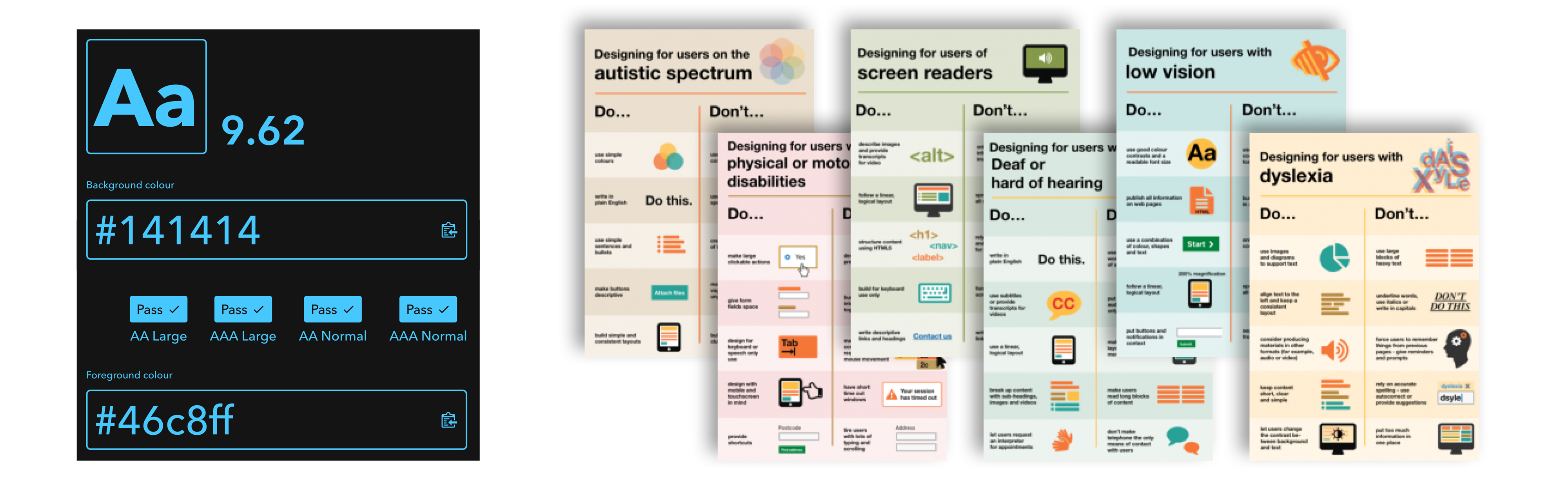
What resources do we use at Transform? We work smarter, not harder. There are so many resources out there that are great to have at your disposal to ensure your work is accessible, as well as act as a backup if you need to flag issues with supplied assets:
As a general rule, we’d recommend:
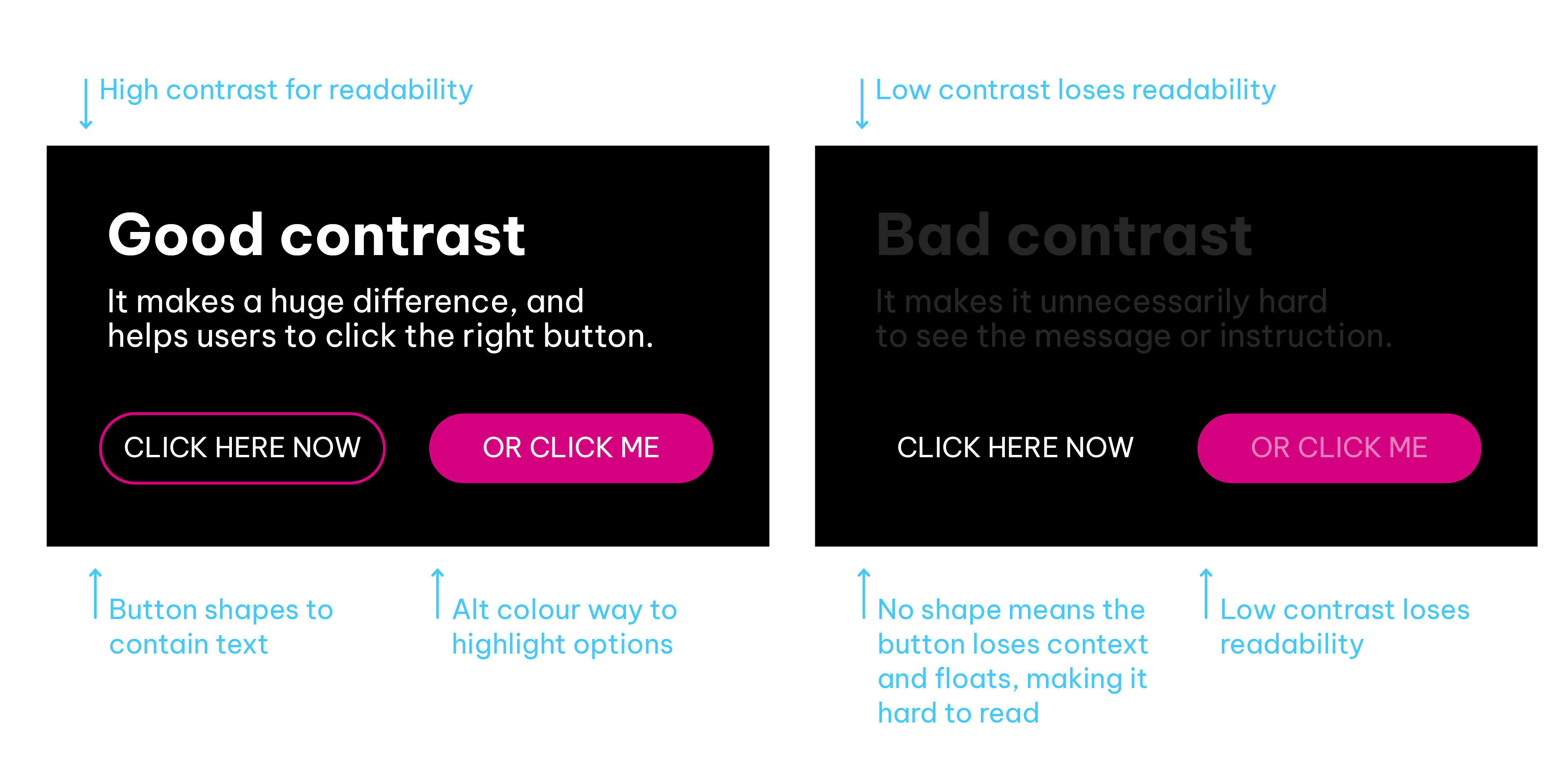
Legibility is how well you see letters. Readability is how easily you read the words.
Best practices include:
It is imperative to consider accessibility throughout the process, and not just have a ‘accessibility check here’ stage towards the end:
The best way to do this is to conduct an audit at the start. This gives you a base level against which you can measure future improvement. If your output is already live and you need to make changes then use all the tools available. Identify where you are now, and where you want to be, set yourself benchmarks, then run your outputs through these tools. Make changes, get feedback and re-run the audit to measure your improvements.
Talk about it. If you’re making changes to improve accessibility, get real-life feedback from users. Join forums and social media groups, get direct feedback and testing from people who will benefit the most from it. Take on this feedback, set goals for yourself, and make improvements. It’ll improve the result and save you some trial and error as well.
Keep an eye on SEO and engagement – if you have made meaningful changes, you should see an improvement.
Remember this isn’t a one-and-done process. Set regular reviews throughout the year, assess and reassess to improve constantly. The first audit you do will be the biggest, but you should be able to make meaningful and swift improvements every time you test.
Whether you are intentionally or accidentally isolating potential users, you’re missing out on a huge demographic. By creating easier to use, more intuitive User Interface (UI), User Experience (UX) and more readable and legible designs, you’re not only making it easier for the average user to interact with your product, but you’re also opening the door to a lot of audiences that were previously locked out. We have seen time and time again that websites with better accessibility scores have much higher SEO results and are often prioritised by search engine algorithms.
Word of mouth is a powerful tool. If you’re opening doors to larger audiences – people notice. They talk. There are communities, social media accounts and groups who share and recommend services you can swap to based off their accessibility and inclusivity.
This space is forever evolving, and the goal post will likely continue to move as we make advances. Ensure you’re mindful of accessibility all the way through the design phase. Resources, tips and tools are constantly developing so keep an eye out for updates. Collaborate, ask for feedback and get insights from people of all walks of life. Test it, then test it again. Then continue to test it regularly. These tools and guides aren’t here to restrict your creativity. They’re guardrails to help improve your work and the overall user experience.
At Transform Comms, we believe good designs are those that can be enjoyed by everyone. If you want to make sure you're doing all that you can – or if this is new to you, and you want to make sure you’re getting the basics right – we're happy to help.
Check out our branding and design services, or get in touch.
We're always up for a coffee and conversation.
Fill in the form, drop us a line at info@transformcomms.co.uk, or call us on 01225 863846. Better yet, drop in to our converted barn and film studio near Bath and Bristol.
Let’s transform.
Together.


